
- Fordham recently released a preview of its updated website, which has an array of new features.

By Laura Sanicola
As part of a continued effort to facilitate the navigation of the university’s website, the Online Communications Development and University Relations department released on Friday a preview of Fordham’s new official website.
The link to the new website was released via email from Donna Lehmann, director of online communication development and university relations.
In the email, Lehmann advised students to “note that [the website] is still a construction zone” which still has several links leading back to the current website. Lehmann also provided students with an email address where they can submit feedback on the website. Although the website is projected to launch in the coming weeks, the email states that due to the launching of 4,000 new pages, “some offices, departments, centers, and institutes will not be migrated into the new site until spring.”
Leah Puri, FCRH ’17, is one of many students who finds the current website disorganized and difficult to maneuver.
“The current website looks so old,” Puri said. “It’s so annoying to find information, like that about the core, because it is so hidden. And when you do find what you’re looking for, there’s not enough information about it.”
To Puri, the aesthetic appeal of the new website is something that can work in both in favor of the university and its students.
“If I was applying to Fordham now and I used this new website, I would definitely be drawn in more than if I used the old one,” she said.
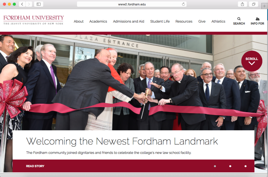
Aesthetically, the homepage features larger and bolder text along with news features accompanied by full screen images. Links to the Lincoln Center and Rose Hill pages, respectively, figure prominently above those to the Westchester Campus, London Centre, and Louis Calder Center. News spotlights are categorized in colored boxes resembling a blog theme, sitting atop a video on undergraduate research and a bolded quote from a history professor.
Ambiguous drop-box titles have been renamed and consolidated, the search bar has been expanded and the logo is now featured on the upper left corner of the homepage.
So far, student opinions on the website’s new look have varied.
“It looks like the Gabelli website,” said Amada Hassan, FCRH ’17. “Very much like a blog.”
“I don’t know if I like it,” Hassan added. “Maybe the school is using this format to make it more relatable to students?”
- The homepage features larger and bolder text along with news features accompanied by full screen images.

“I hope this link glossy façade, considering the current website is so hard to navigate,” said Kaitlyn McWha, GSB ‘17.
Both McWha and Hassan noticed some aspects of the new website that are likely to cause headaches amongst students who are using it for the first time.
“I really had to search for the login to the My.Fordham page,” said McWha, referring to the links new position at the very bottom right corner of the website. “I’m hoping as the continues to develop they can put the My.Fordham at the top where it is more accessible to students.”
“It also took me a while to find the ‘libraries’ page,” said Hassan, referring to the new libraries link, which has its own drop-box at the top of the current website and is now listed under the resources drop-box.
Overall, students seem to agree that accessibility is the most important attribute of a successful website.
“Everything needs to be more comprehensively explained, especially important information like that on scholarships and the faculty research,” said Puri.
“This new layout is nice, but if things still aren’t accessible, it isn’t going to make a difference to us,” Hassan said. “It may just take some getting used to.”
